TOVALA REBRAND
Branding, Art Direction
2022
Tovala is a D2C food and tech company founded in 2017. From raising over $100,000 within 24 hours of its Kickstarter campaign, Tovala has scaled to a growth-stage national brand recognized by household names like Oprah Daily, Buzzfeed, and People Magazine.
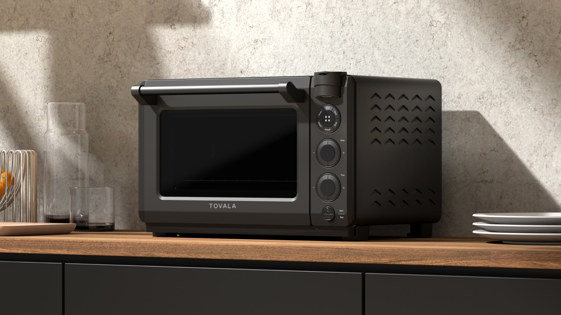
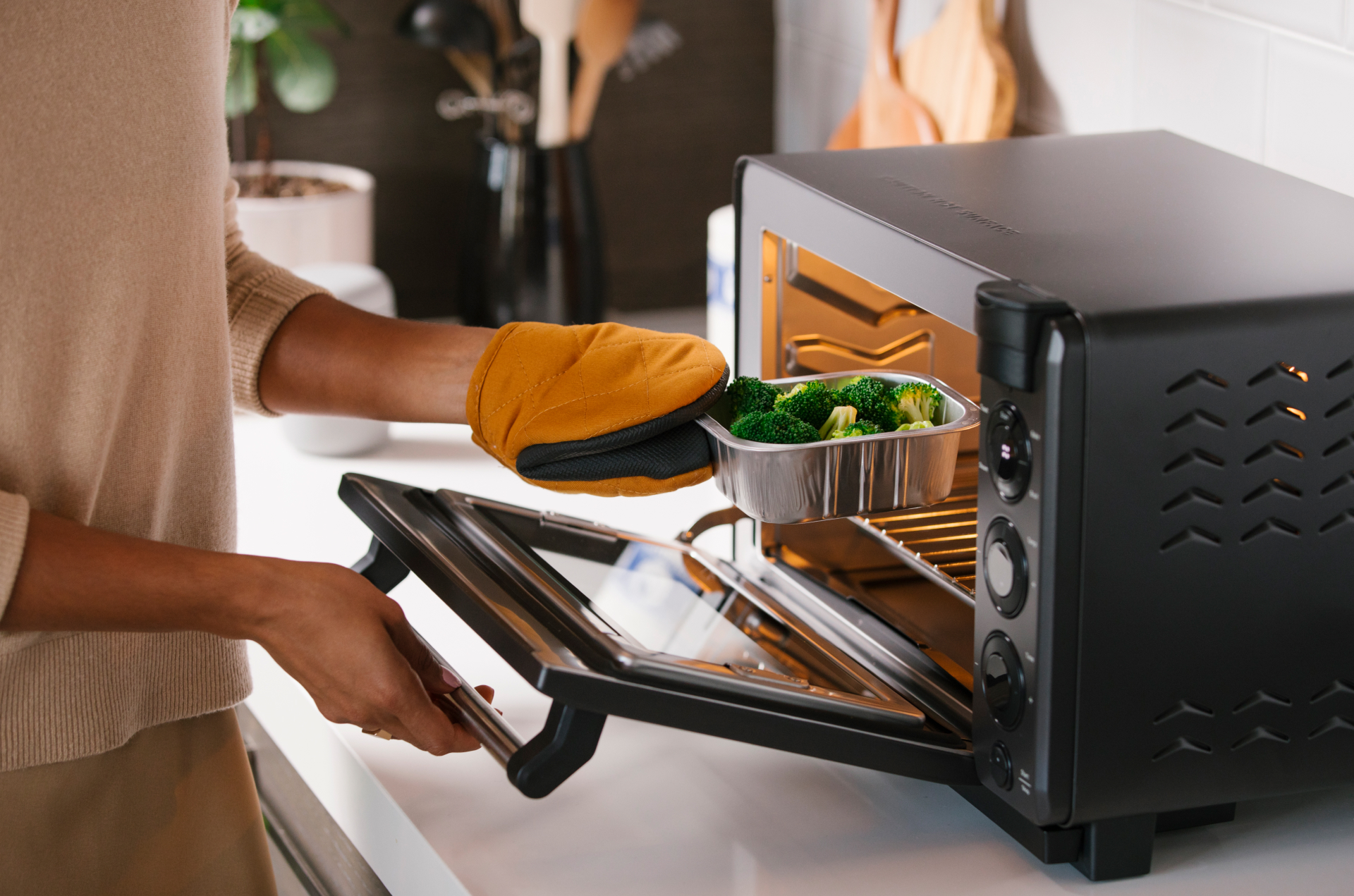
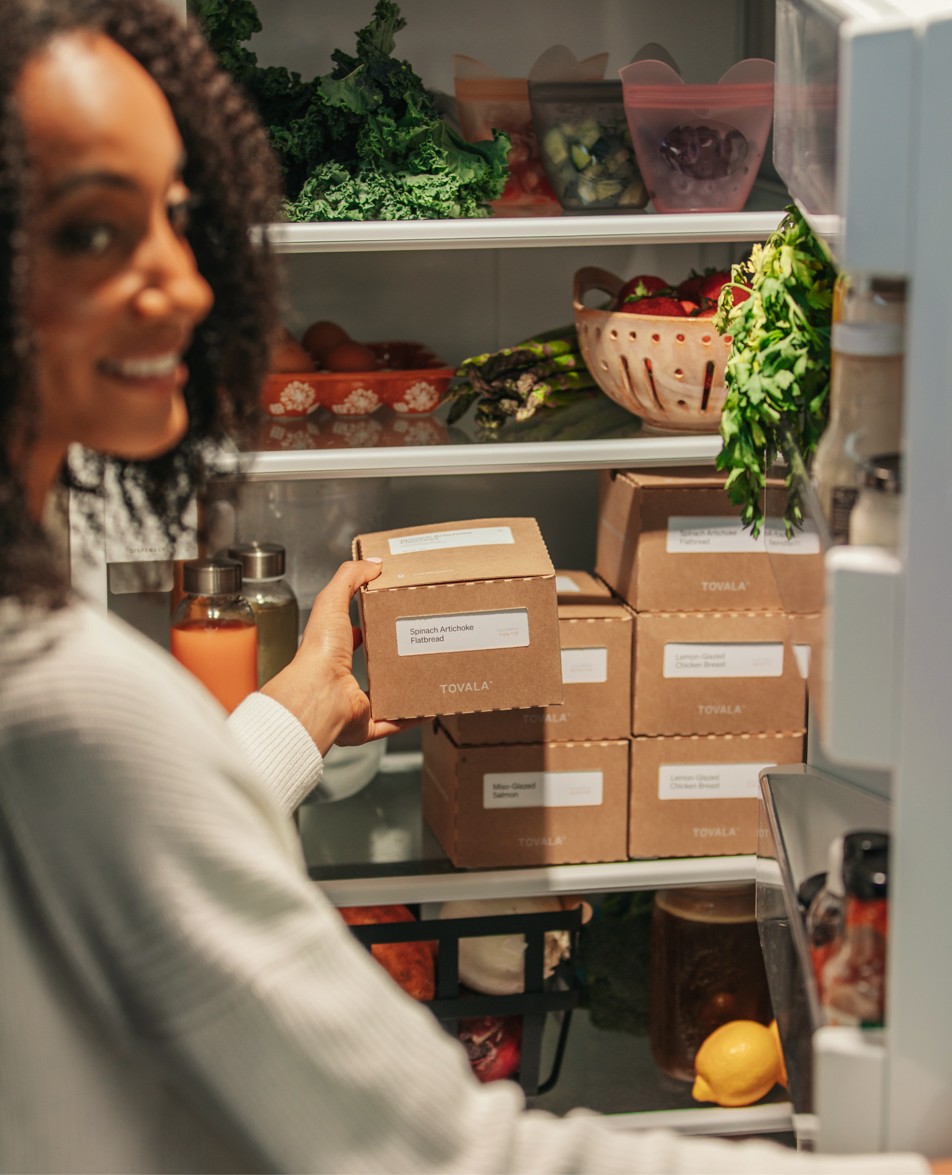
The company offers a one-of-a-kind solution to meal prepping and cooking. The system comprises of a countertop-friendly Tovala Smart Oven, the Tovala App, and a Tovala Meal subscription.
PROBLEM
As Tovala scaled and raced toward profitability and becoming a household name, there was a disconnect between the innovative product being offered and the brand.
SOLUTION
Recreate an elevated Tovala brand that is sustainable and timeless, celebrates the high quality and uniqueness of the product, and embodies a human-centric story to emotionally connect with consumers.
ROLE
Lead Art Direction (Photography), Brand & Graphic Design
Lead Art Direction (Photography), Brand & Graphic Design
TEAM
Jason Punches - Creative Direction
Maggie Pluskota - Lead Copy
Jia Hong - Package Design
Aliyah MacCrindle - Production
Fix Studio
VeryTaste
Jason Punches - Creative Direction
Maggie Pluskota - Lead Copy
Jia Hong - Package Design
Aliyah MacCrindle - Production
Fix Studio
VeryTaste
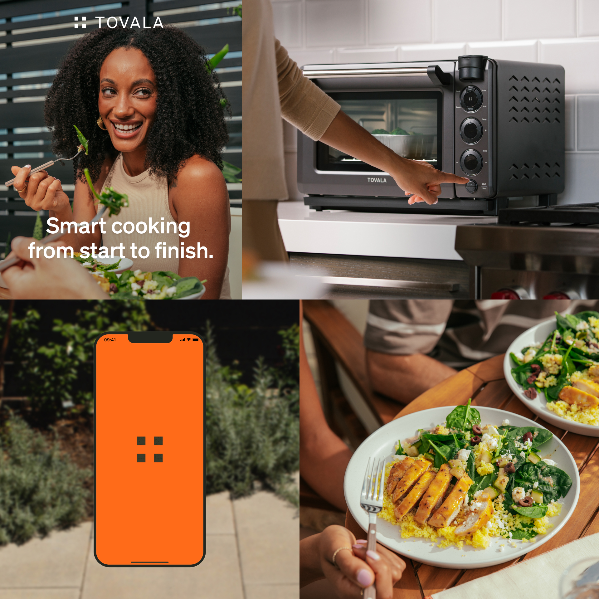
THE MARK
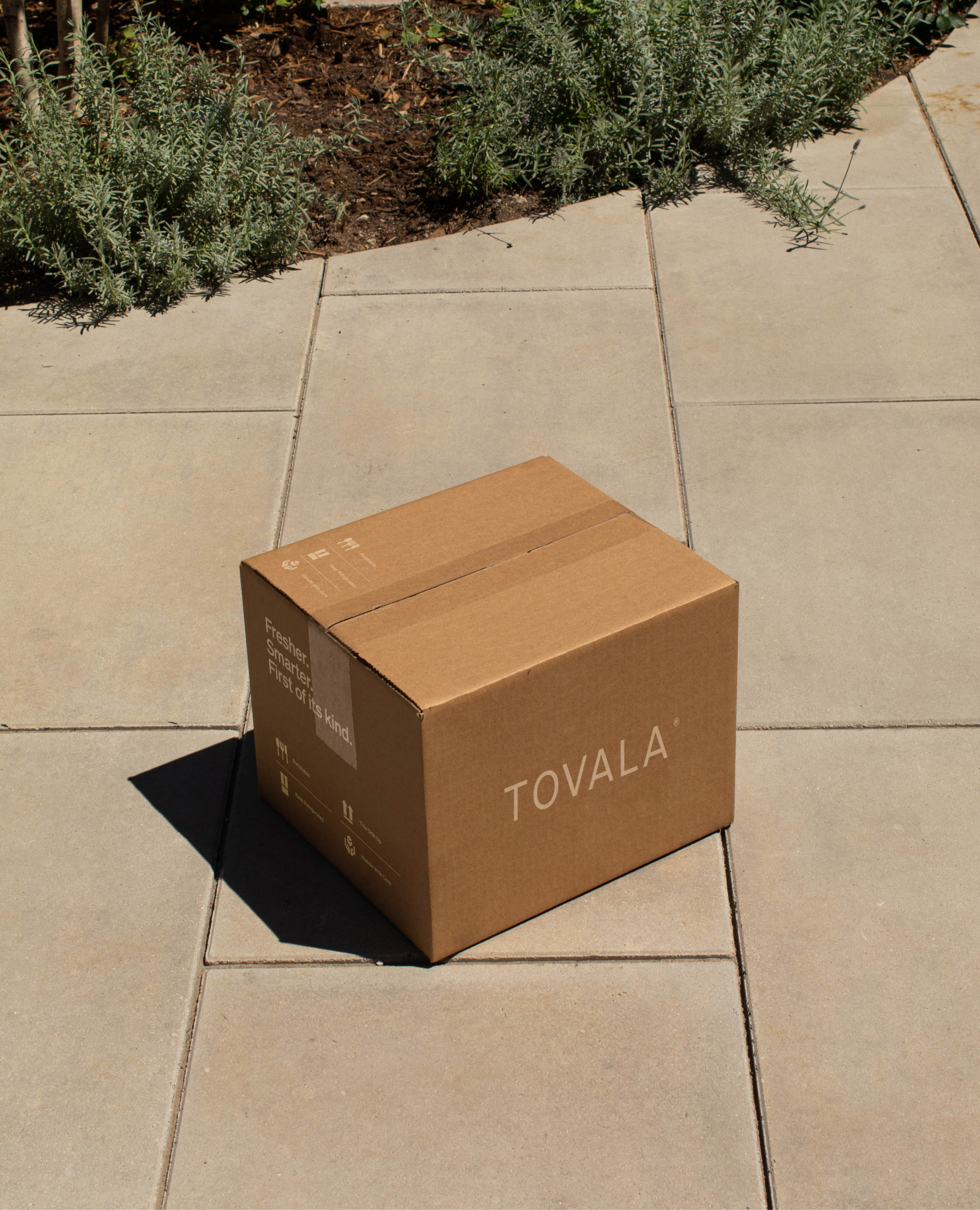
Tovala’s logo mark is coined as, “The Portal.” The key to Tovala’s offering of good food made simple is the QR code. A QR code is represented on the packaging of each meal, which the Tovala Smart Oven scans. Through that QR code, all the complexities of cooking a full meal is boiled down to one scan.


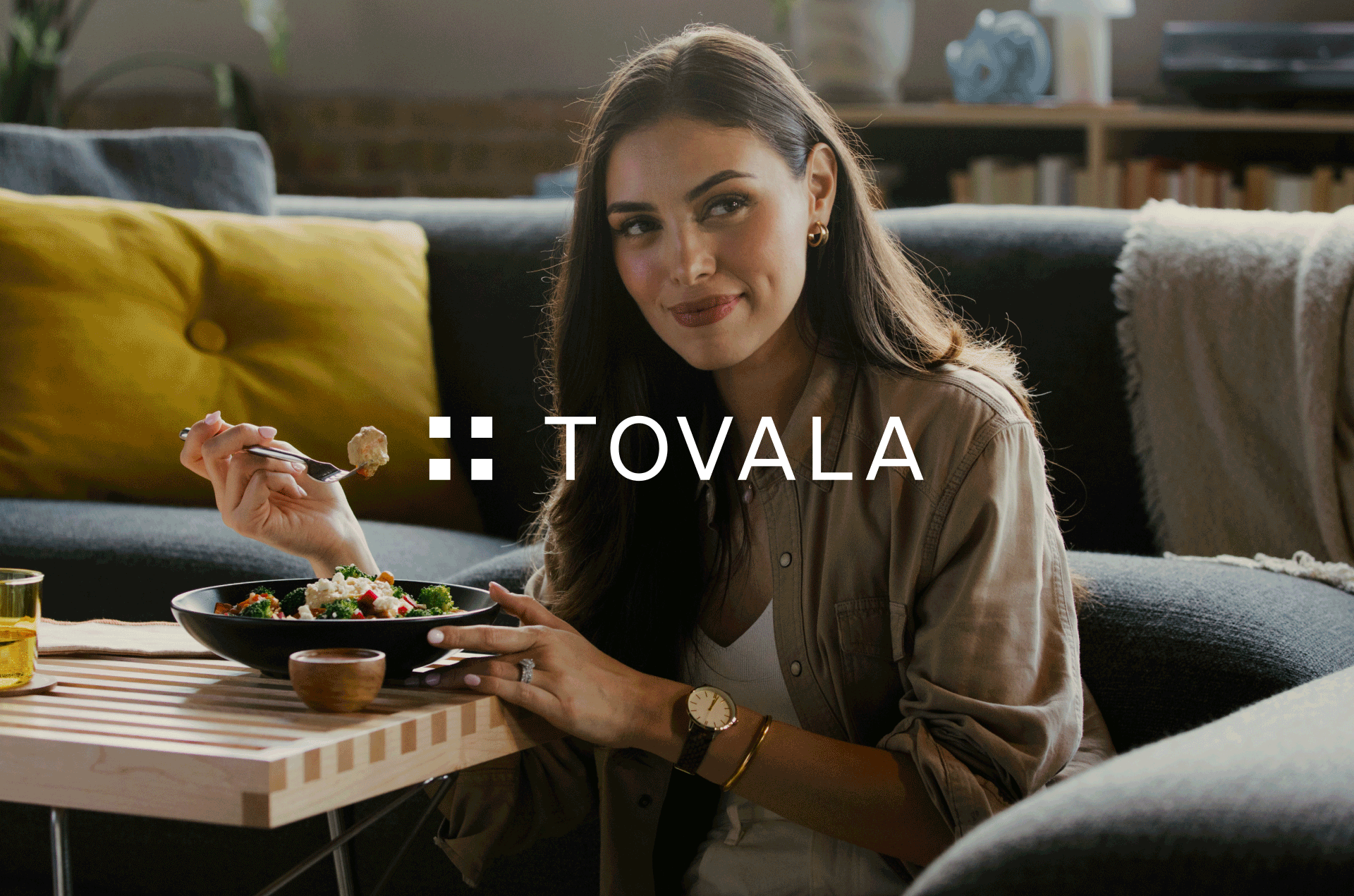
THE PHOTOGRAPHY
Defining and refreshing the photography was vital to bringing in warmth and an emotional connection to a minimalistic graphic visual identity. The new photography evokes positive emotions of joy, boldness, and authenticity.


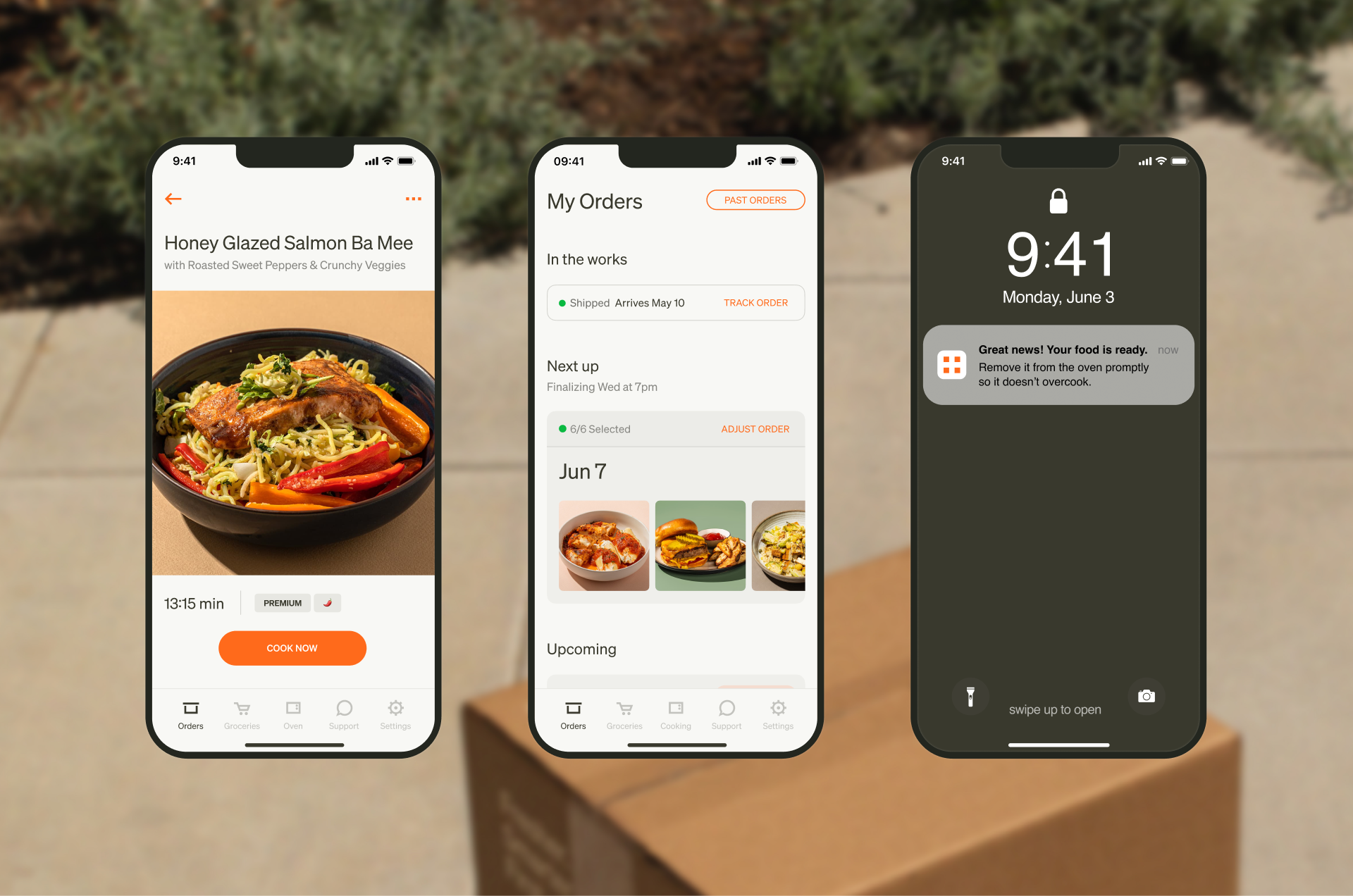
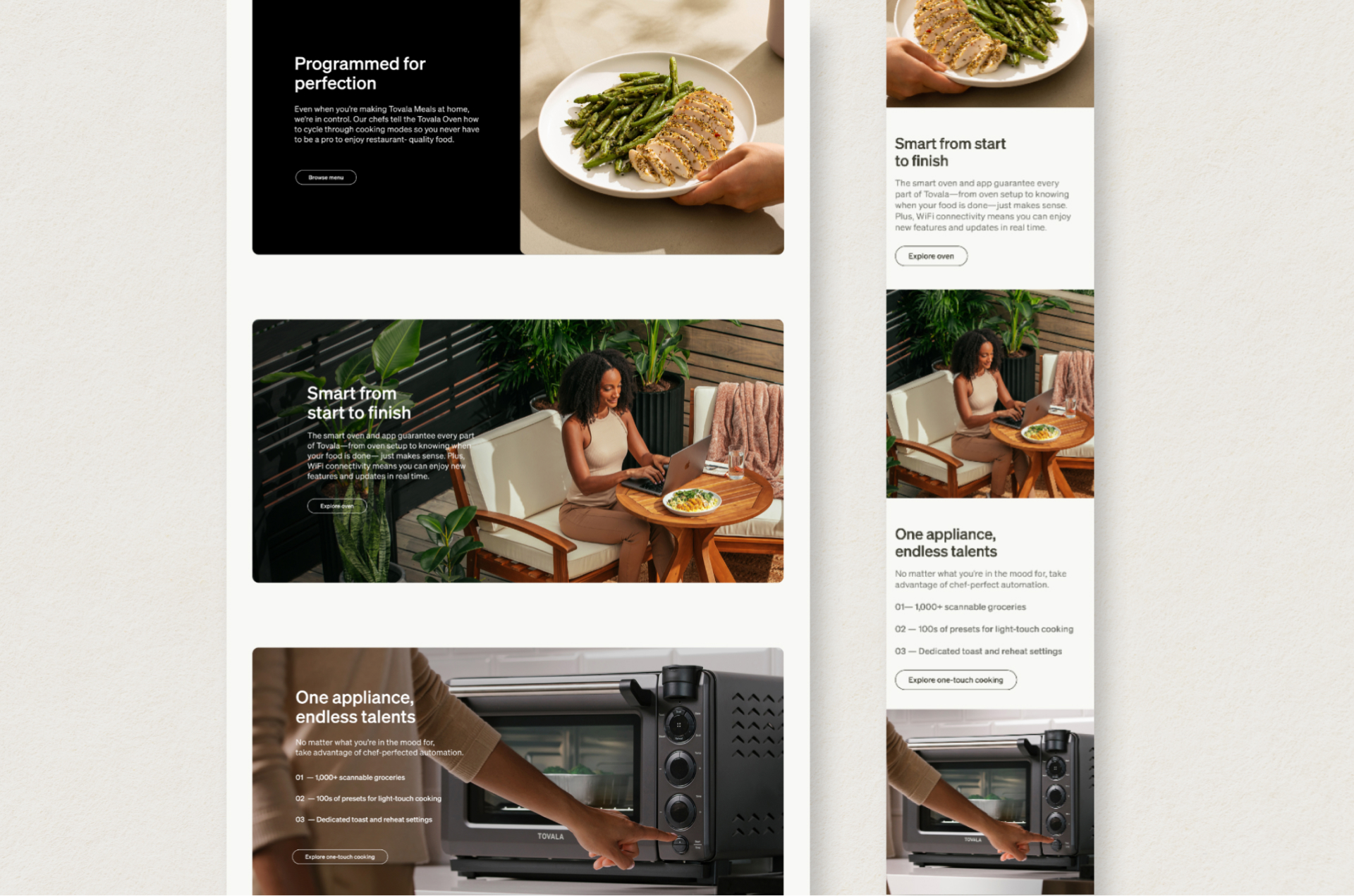
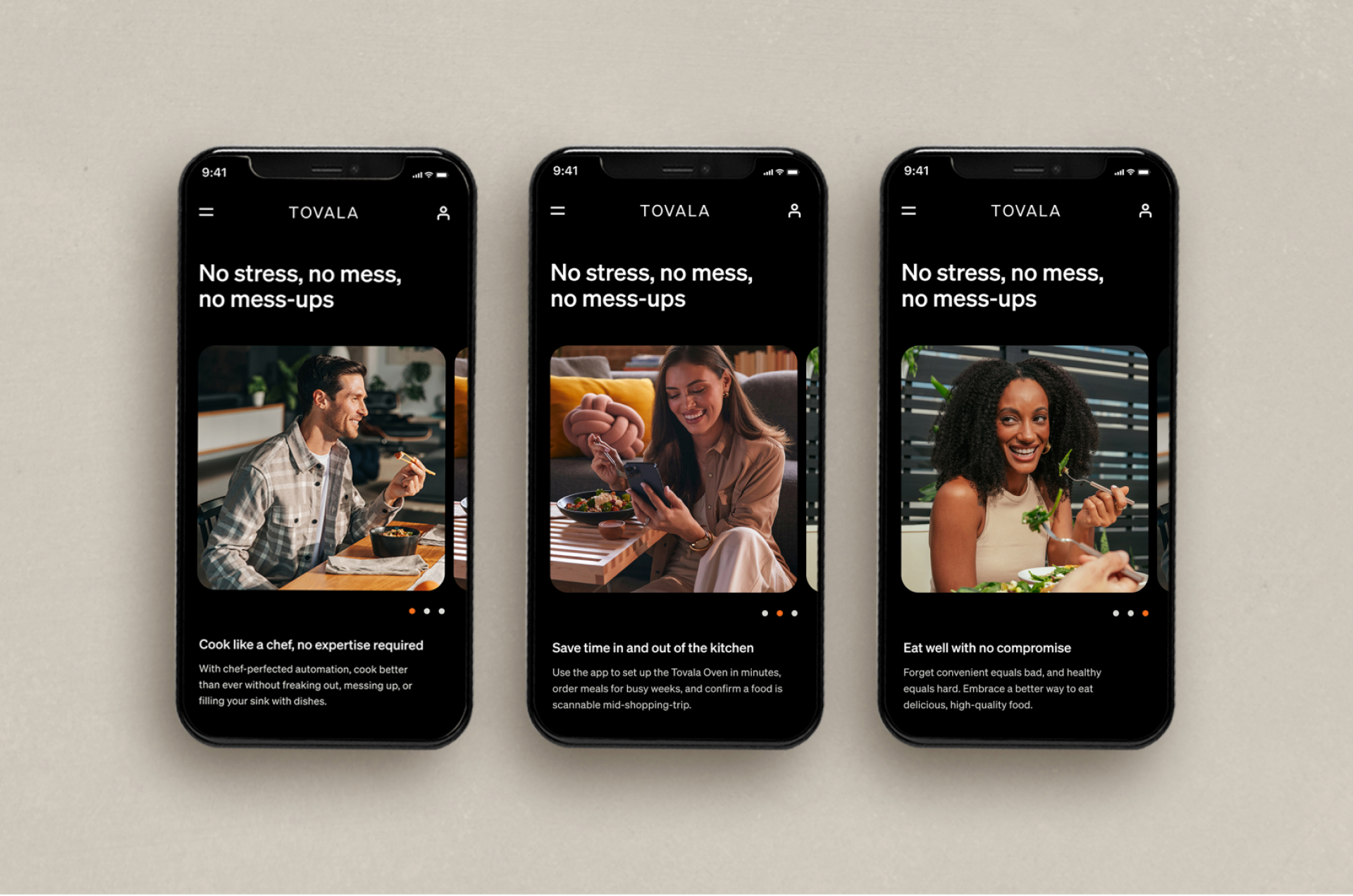
WEBSITE & APP OVERHAUL
Rebranding in-house meant requiring an overhaul of our digital presence, most importantly, the website. For a deeper dive into redesigning tovala.com, check it out here.
Rebranding in-house meant requiring an overhaul of our digital presence, most importantly, the website. For a deeper dive into redesigning tovala.com, check it out here.


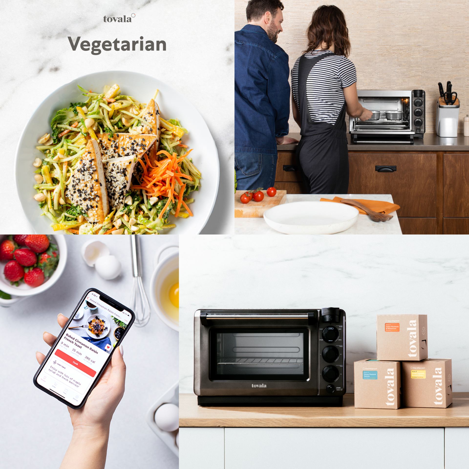
BEFORE
Cooking & Food-focused, Warm & Fuzzy, Light & Airy
![]()
Cooking & Food-focused, Warm & Fuzzy, Light & Airy
AFTER
Smart Meals & Tech-focused, Saavy & Differentiated, Authentic & Bold
![]()
Smart Meals & Tech-focused, Saavy & Differentiated, Authentic & Bold